The Project
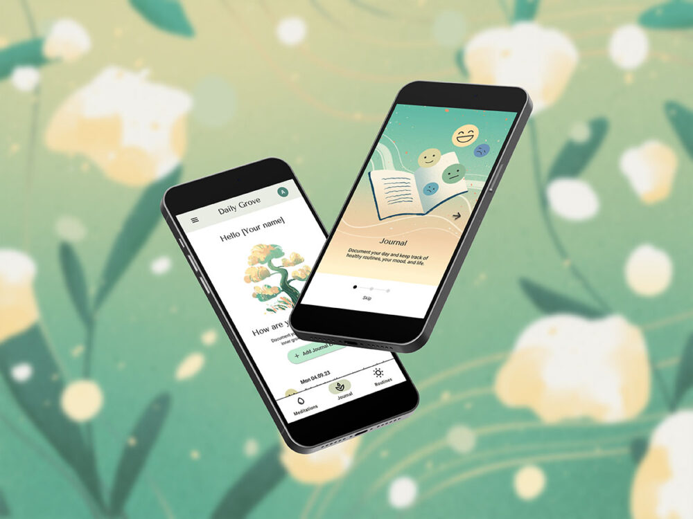
Daily Grove is a mental health app that promotes establishing healthy routines. By offering a journal function, guided meditation exercises, and detailed statistics, the app aims to keep track of daily habits and moods.
- My Role: UX Researcher, UX & UI Designer
- Applied UX Methods: Competitive Analysis, Personas, User Journey Mapping, User Flows, Wireframes, Prototyping, Usability Tests, A/B Tests, Styleguide, Accessibility Standards.
- Tools used: Figma, Miro, Lyssna, Photoshop, Clip Studio Paint
Understanding the Problem
Many people have difficulty maintaining healthy routines in their day to day lives. Those affected by mental health issues may find it even harder to keep track of their health. Outside of therapy, they may not be confident about performing learned techniques (.e.g mindfulness) without guidance or they may lack the strength or motivation to keep routines.
My solution: The Daily Grove App is a tool for the described struggles. It’s a calming and empathetic mobile app, tailored to keep track, motivate, and empower individuals to lead healthier lives.
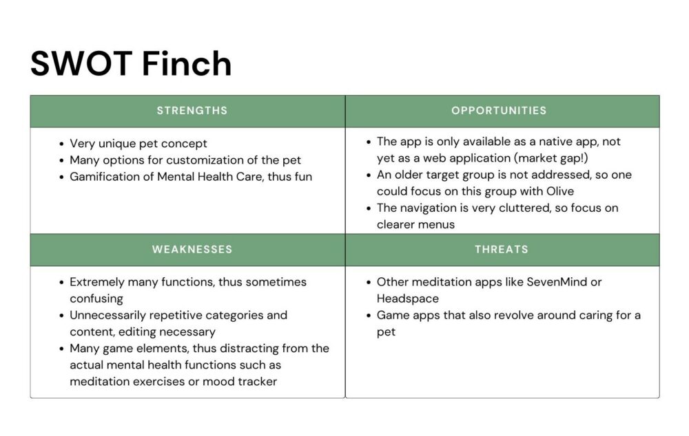
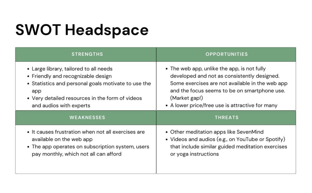
Research: Competitive Analysis
The next step of the creation process was researching competitors: Which other mental health apps are available to people? I evaluated the strengths and weaknesses of these competitors, and identified gaps in the market. The Strengths, Weaknesses, Opportunities, & Threats (SWOT) Profiles below are part of a detailed competitive analysis.
Personas
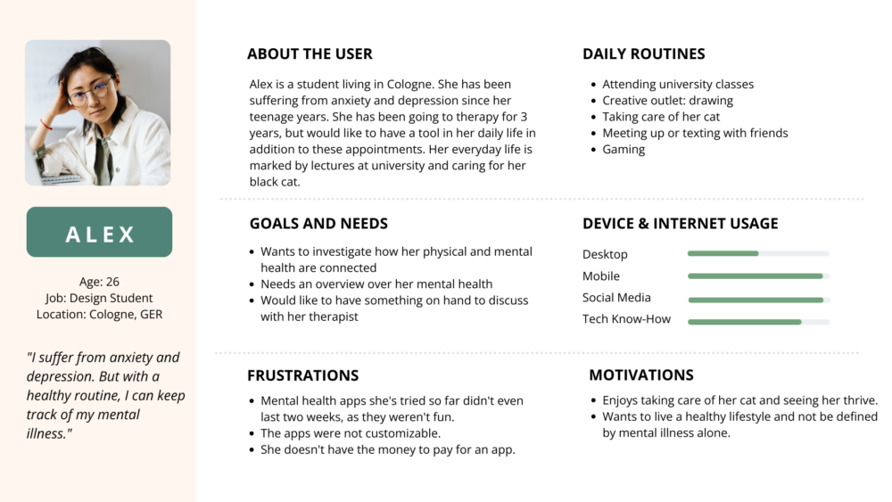
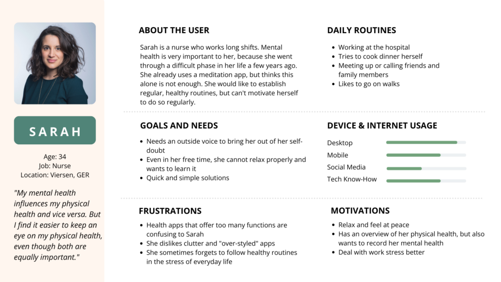
I conducted three remote interviews to research potential users’ motivations and needs further. The results confirmed the hypotheses that had previously been put forward (e.g. on mental health strategies used and frustration points). The insights also revealed unexpected motivators: participants observed that their pets and plants they cared for gave them strong routine and support.
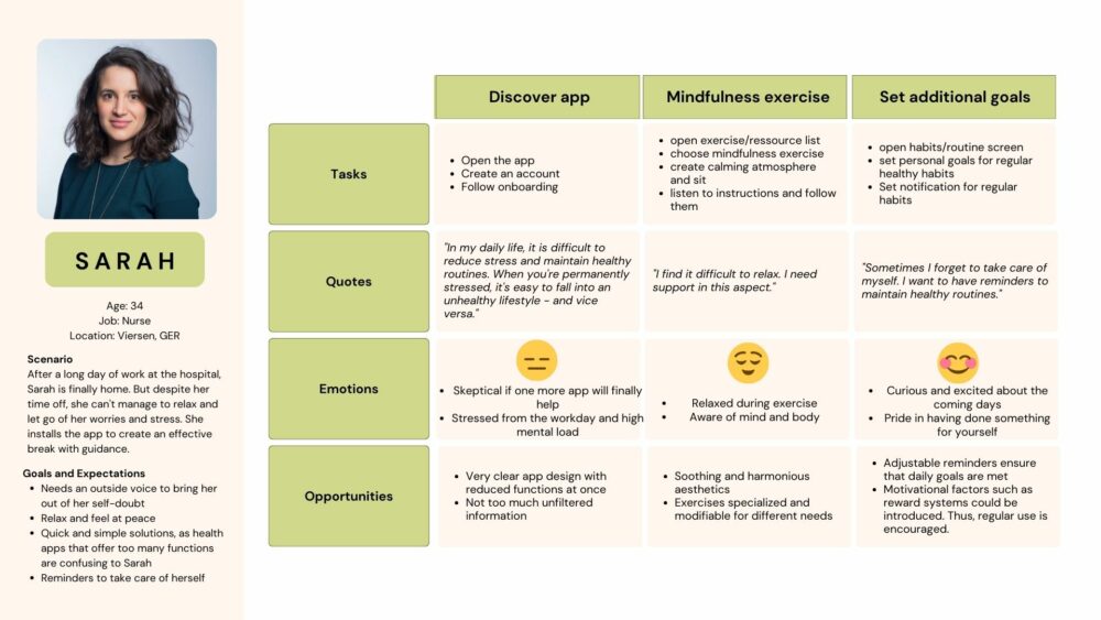
Based on the interviews, I created two personas with distinct characteristics: Alex and Sarah. They are personas whose mental health is a high priority, but have different degrees of mental health problems.
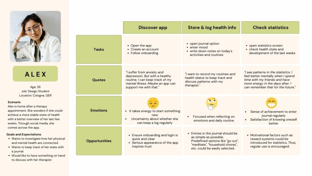
User Journey Maps & User Flows
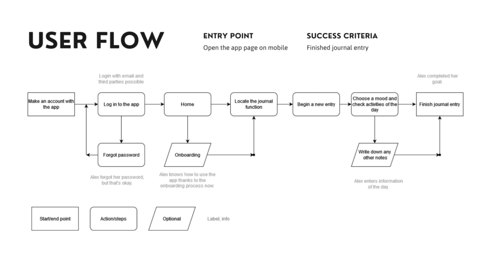
How would our personas Alex and Sarah navigate a mental health app and its main functions? To investigate that question, I constructed user journey maps and user flows for three tasks of Daily Grove: Creating a journal entry, follow a meditation exercise, and checking personal statistics.
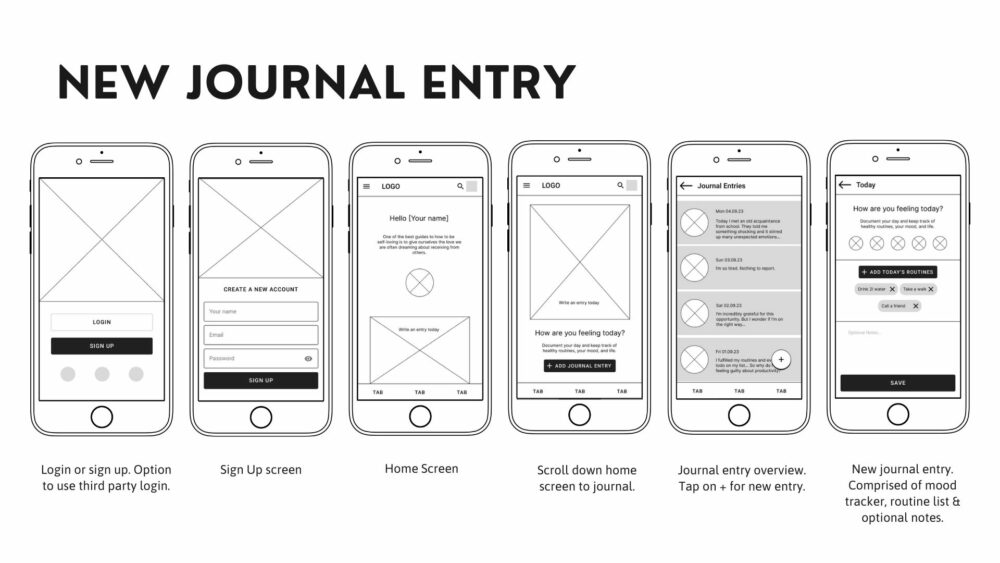
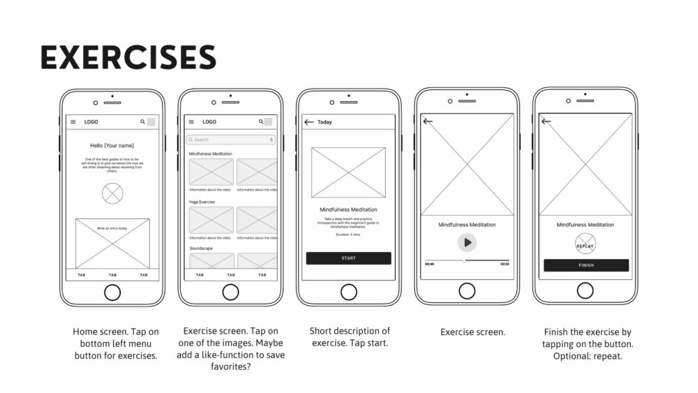
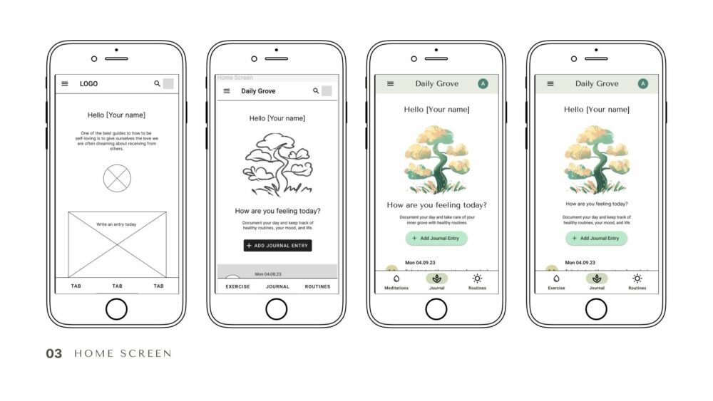
The First Wireframes
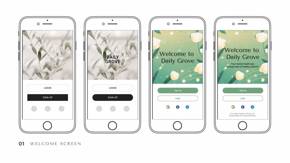
After developing the user flows and conducting a card sort to test the basic navigation structure, I sketched low- and mid-fidelity wireframes. I created a grayscale, clickable first prototype in Figma.
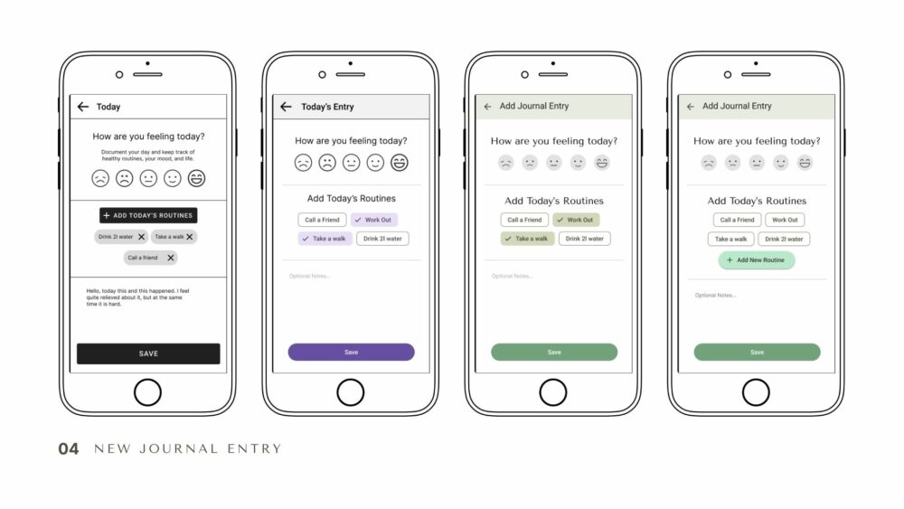
Usability Tests
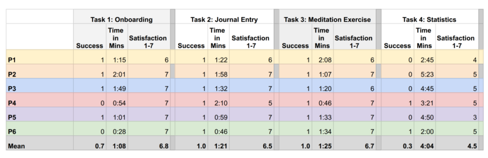
I take a user-centered approach in my design decisions. Therefore, feedback rounds and early usability tests are irreplaceable. After thorough preparation (creating a test plan, test script, schedule), I conducted six usability tests – both remotely and in person – with the initial prototype. The participants were recruited via personal circles, the CareerFroundry Slack, and social media. They all matched the user profile.
The goal of the study was to assess the learnability for new users of Daily Grove. I wanted to observe if users understood the app and how they completed basic functions (e.g. logging in, adding new journal entries, or going through an exercise). In addition, I measured metrics such as satisfaction, time to complete a task, and their success rates.
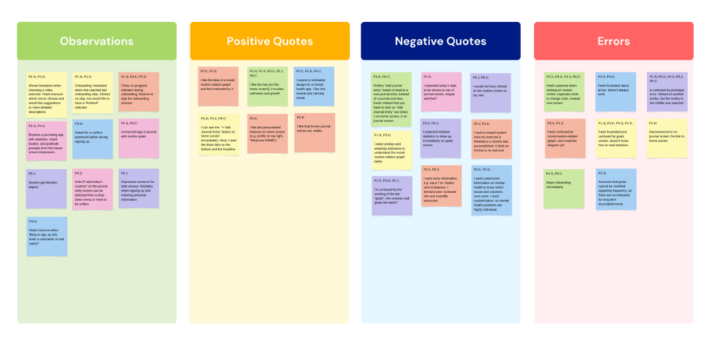
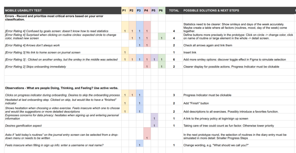
After carefully reviewing the research material, I wrote a report on the findings. Some key insights were:
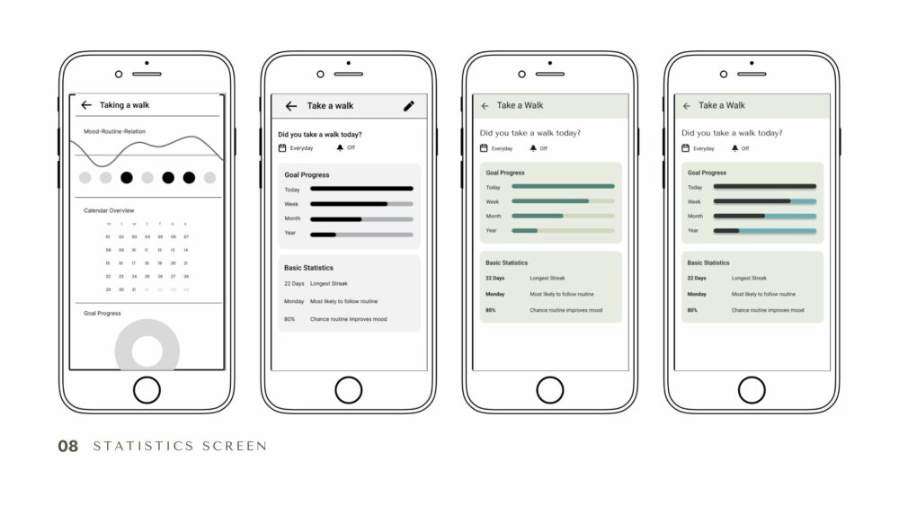
- Participants pointed out that the statistics screen was hard to grasp, as they were surprised by unexpected interactions and were confused by the diagrams with little information.
- The prototype buttons had to become more precise and follow the participants’ mental model.
- The wording of categories had to be reviewed. In general, all text elements needed careful revision.
- All participants enjoyed the tree illustration on the home screen.
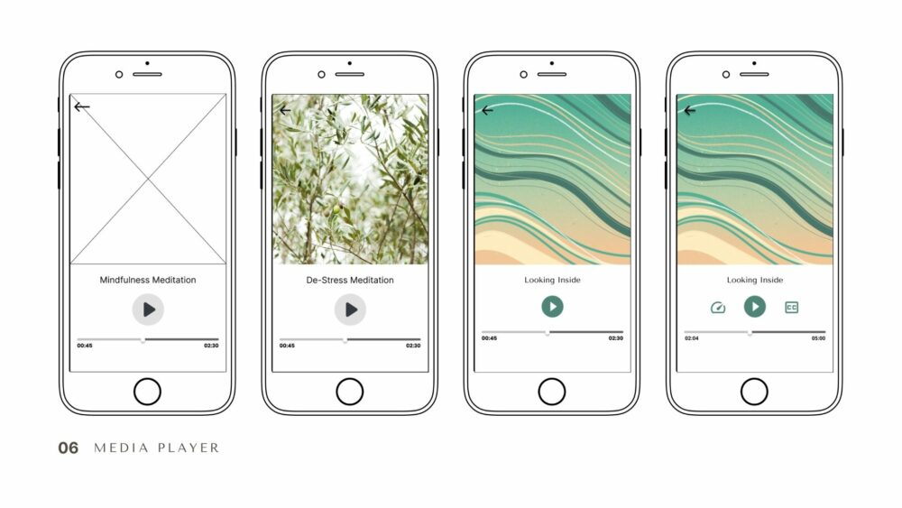
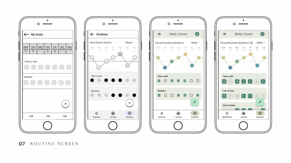
Iterations: The Design Process
The creation process of the app is based on the iterative design approach: Daily Grove’s design has continuously been improved to make it more useful and usable. In the following images, example screens and their creation are shown step-bystep from left to right. As the project progressed, several key iterations stages marked its development.
Stage 1: Prototype Refinement
After the usability tests, it became clear that many aspects of the app needed to be made more intuitive and errors in the prototype had to be corrected.
- Elaboration of the smiley selection in the journal function
- Reconnected links on the statistics page
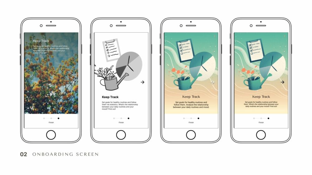
Stage 2: A/B & Preference Testing
A preference test was carried out to determine the style of the graphics in the app.
- Test participants could choose between a photo and an illustration for onboarding.
- First round: A draw, as the onboarding screens showed too many differences.
- Participants commented that they liked different aspects of both designs. These suggestions provided the basis for new graphics in a second round.
- Finally, the illustrative approach won.
Stage 3: Advanced UI Design
The next step was to detail the app’s UI:
- Grids were applied.
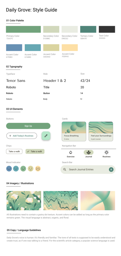
- Color palettes were exchanged according to the color theory and emotional design.
- A style guide was defined.
- The self-drawn illustrations give the app a unique character.
Stage 4: Design Collaboration
The next major iteration step consisted of gathering feedback from fellow UX designers.
- Six peers reviewed the prototype. Their reviews involved:
- Highlighting anomalies in spacing and white space.
- Increasing the contrast of some elements.
- Correcting further errors in the prototype.
Stage 5: Accessibility
The A & AA standards for accessibility were investigated for the next iterative phase.
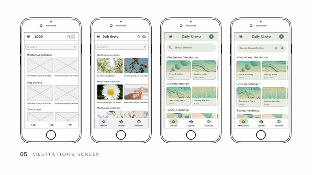
- For those who are deaf or hard of hearing, a subtitle option has been added for the video content/sound clips.
- The search bar of the meditations screen now features a voice recognition option to search for exercises. This serves as an alternative to hand-based interactions and for those with visual impairments.
- The colors were reviewed for accessibility: Contrasts of elements were increased for better visibility.
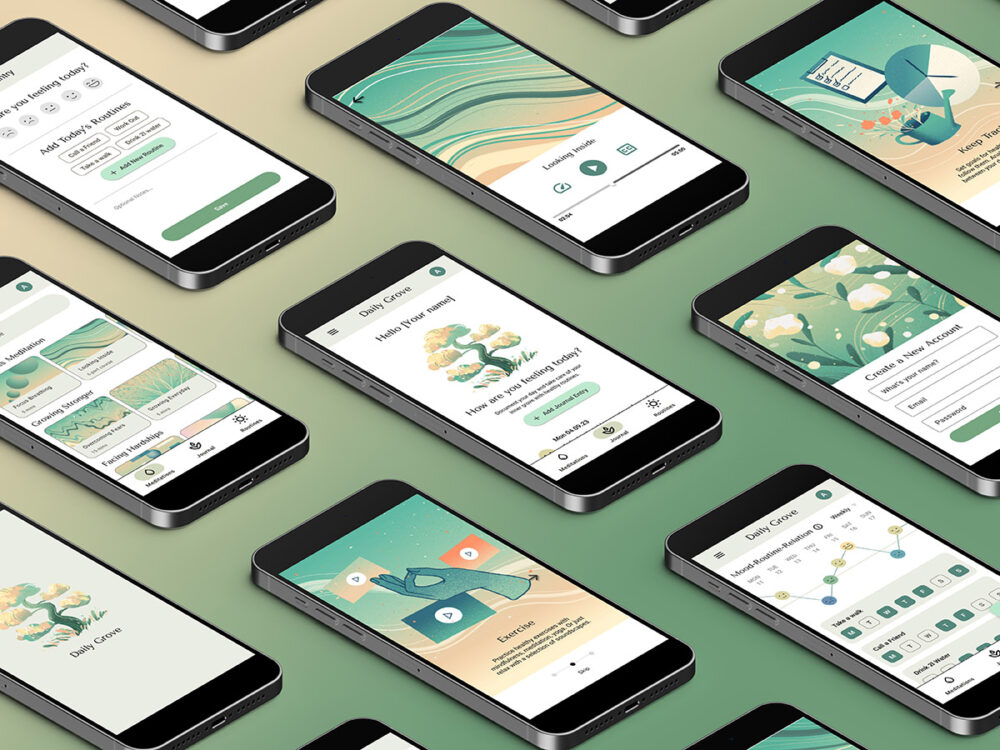
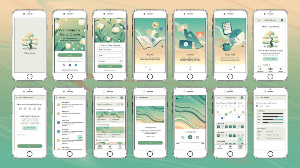
Final Design
After rounds of usability testing and iterations based on Material Design, accessibility guidelines, and peer reviews, I present the following design for Daily Grove.
Conclusion
What I learned during the project:
- Gamification is an extremely motivating factor and can serve as a trigger for regular routines.
- Feedback from a wide variety of sources – whether from mentors, colleagues or users – is invaluable in helping you to adopt new perspectives.
- Research is fun! What I enjoyed most during the project was working on tests such as A/B or usability tests (and the planning around the execution of the tests), the analyses and interviews.
Daily Grove is now an app that has been developed over several stages and with the help of feedback from many different people. The aim of the app is to motivate many people to maintain healthy routines and keep an eye on their mental health. The app can now proudly present the results in a natural, appealing look and optimized usability.