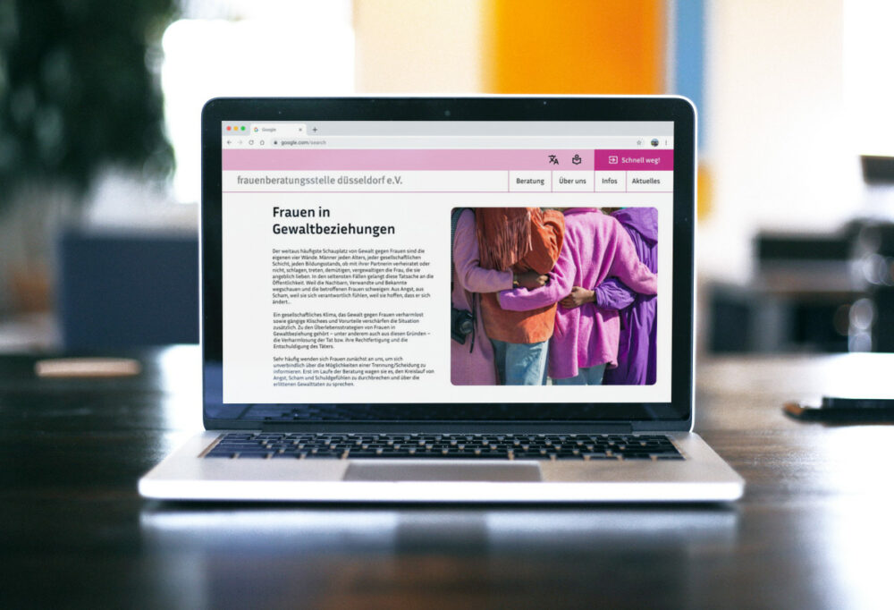

Frauenberatungselle Düsseldorf is a local NGO advocating for women’s rights and providing essential services such as domestic violence consultation. The organization faces challenges with their homepage, as there are accessibility issues, some information cannot be found easily, and the design isn’t visually engaging. This case study documents my process of redesigning the desktop homepage to enhance usability, modernize the design, and improve accessibility.
- Role: UX Designer, UI Designer, Illustrator
- Applied UX Methods: Wireframes, Prototyping, Style Guide, Accessibility Standards
- Tools used: Figma, Photoshop, Clip Studio Paint

Understanding the Problem
Through a heuristic evaluation, it became evident that there were numerous areas for improvement, particularly concerning accessibility. Issues such as low color contrast and inconsistent navigation were identified. Additionally, the layout and organization of content made it difficult for users to locate vital information swiftly. I listed all analyzed problems and suggested first solutions.

Wireframes
Despite the absence of user testing resources, the heuristic evaluation provided valuable insights into the existing pain points and areas of improvement. Building on these findings, I sketched first re-designed wireframes. I created a grayscale, clickable first prototype in Figma. Notable changes are the implementation of a fast exit button in the menu, a reduced navigation, and cards for news.

UI Design
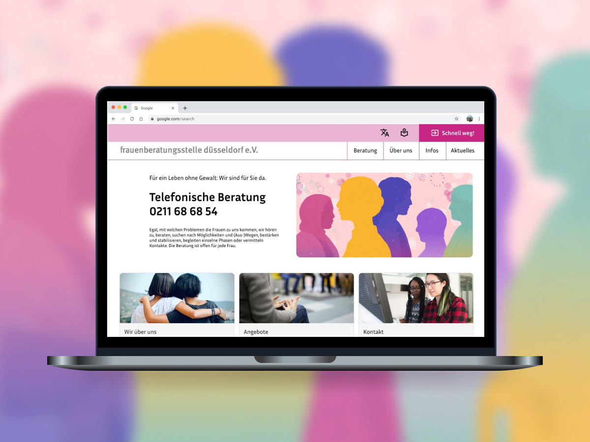
The next step was to improve the user interface: By drawing upon best practices in UX design, the goal was to create a visually appealing and intuitive homepage that would effectively communicate the organization’s message and facilitate access to essential resources for women in need.
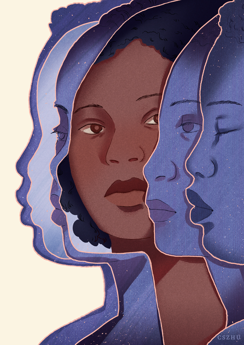
To enhance an easily understood layout, grids were applied. A style guide was crafted to standardize typography and components such as cards. The organization’s iconic magenta/pink was retained in the color palette, maintaining brand identity. I also illustrated two calming images to welcome users and give the NGO a unique landing homepage.

Accessibility
In adherence to accessibility standards, colors were checked to meet the A & AA guidelines for sufficient contrast ratios. Elements throughout the homepage were adjusted to enhance contrast, facilitating easier navigation and comprehension. To further enhance accessibility, foreign language options were implemented and an easy language feature was introduced to provide simplified versions of content.
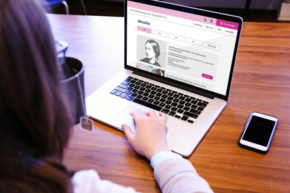
Final Design

Conclusion
What I learned during the project:
- Resourcefulness in Design: Despite limited resources, heuristic evaluation and adherence to accessibility standards enabled significant improvements. Although tests are essential for an in-depth user-centered approach, the homepage is already much more appealing.
- Color as Brand Identity: The homepage remains recognizable yet refreshed, striking a balance between familiarity and contemporary design. This is largely thanks to the bright magenta coloring.
The redesign of the Frauenberatungsstelle Düsseldorf homepage resulted in a more accessible, user-friendly, and visually engaging platform, empowering the organization to better serve its community and advance its mission of women’s rights advocacy.